Creating attention-grabbing ads is super important if you want people to stop scrolling and check out what you have to offer. The part of your ad that people notice first is the creative—this includes images or videos that you use in your ad. Let’s break down the steps to make sure your ad creative stands out and performs well.
Understanding Ad Anatomy
Before we dive into designing, let’s understand how an ad is structured:
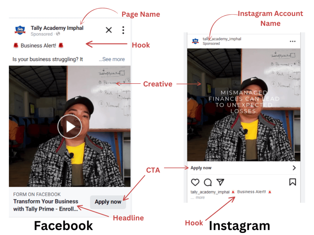
- Facebook Ads:
- Facebook Page Name: Appears at the top, showing who’s running the ad.
- Primary Text: This is often the “hook,” like “Business Alert!”—something to grab attention.
- Creative: This can be an image or a video that represents your product or service.
- Call to Action (CTA): Right below the creative, this is the button (like “Apply Now” or “Learn More”) that tells people what to do next.
- Headline: This sits above the CTA and gives a clear message, such as “Transform your business with Tally Prime.”
- Instagram Ads: Instagram ads look pretty similar to Facebook ads. You see the Instagram account name, the creative, and the CTA. The hook and message are also displayed to get people interested.
Video vs. Image: Which One to Choose?
Now, you might wonder whether a video or an image works better for your ads.
Most of the time, videos work better because they grab more attention and keep people engaged longer. But in some cases, like certain industries or niches, images can perform better.
So, experiment to see what works for your specific product or audience!
Designing Ads: The Basics

When designing your ad, start by thinking about the people you want to attract. You want to make sure your ad grabs their attention, sparks their interest, makes them want your product, and finally leads them to take action (like buying or signing up). This is sometimes called the AIDA model (Attention, Interest, Desire, Action).
Here are some tips for designing effective creatives:
- Use High-Quality Images/Videos: Always choose sharp, clear, and engaging images or videos. Low-quality content makes your ad look unprofessional.
- Bright Colors Work Best: Bright colours catch people’s eyes better than dull or dark colours. Use vibrant tones that fit your brand.
- Stay Consistent with Your Brand: Every brand has colours they use consistently (like Coca-Cola’s red or WhatsApp’s green). Choose colours that represent your brand well, and stick to them in your ads.
The Importance of Brand Colors
Different colours can make people feel different emotions. For example:
- Red can symbolize energy or excitement (like Coca-Cola).
- Blue often feels calm or trustworthy (like Facebook or Intel).
You can check out this link to learn more about the hidden meanings of colours: The Power of Colors in Branding: Unveiling Their Hidden Meanings
When you design your ad, think about how colours make people feel and how you want your brand to come across.
Keep Fonts Consistent
Just like colors, the fonts you use in your ads should be consistent. Don’t use too many different fonts, as it can make your ad look messy. Stick to one or two fonts for a clean and professional look.
Scroll Stoppers and Creative Tips
A scroll stopper is something in your ad that makes people stop scrolling through their feed. You want your creative (image or video) to be a scroll stopper! Here are a few tips:

Use Frames in Photos: A frame around your photo makes it look more polished and professional.

Pay Attention to Symmetry: If you’re using text in your image, try to centre it or make it symmetrical for a more pleasing look.
Use Negative Space Effectively: Negative space is the empty space around your image or text. If you fill up every inch of your image with stuff, it’ll look cluttered. Leave some space around your elements so they stand out better.
Keep It Simple: Don’t overload your creative with too much text or too many elements. Less is more!
How Many Creatives Do You Need?
For each ad campaign, aim to create:
- 3-4 graphics (images)
- 1-2 videos
This gives you enough variety to see which creative works best without overwhelming your audience.
Optimize for Different Placements
Your ads can show up in different places on Facebook and Instagram, like in people’s feeds, Stories, or the sidebar. Each placement might need a different image size or format. Make sure to optimize your creative for each placement, so it looks great everywhere.
Follow Facebook’s Ads Guide
Even though Facebook no longer has the strict “20% text rule” (which said that ads with too much text performed worse), it’s still a good idea to keep text minimal. Less text in the image helps people focus on your creative. You can always include more detailed information in the ad copy, which is the text that shows up above or below your creative.
Check out Facebook’s official Ads Guide for more tips on how to optimize your creatives for Facebook and Instagram ads.
Canva Walkthrough: Create Your Own Designs
Canva is a free, user-friendly tool that lets you design both images and videos for your ads. Let’s walk through how to use Canva to create your ad creative.
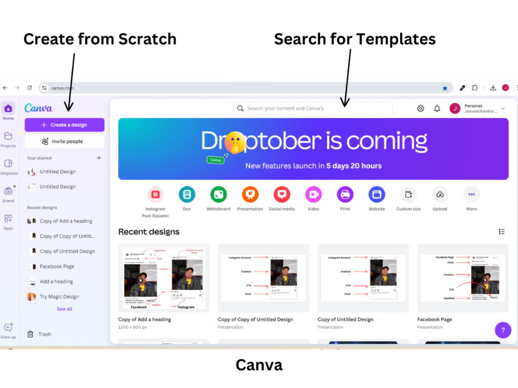
- Search for Templates:
- Open Canva and search for pre-made templates that fit your content (e.g., “Instagram Post”). These templates are ready to use, and you can just customize them with your own text and images.
- Create from Scratch:
- If you prefer to design your creative from scratch, click on “Create a Design” and choose the dimensions you need (e.g., Instagram Post Square 1080x1080px). You’ll then see a blank canvas where you can start adding elements.
Canva Tools
On the left side of Canva, you’ll see a menu with different tools:
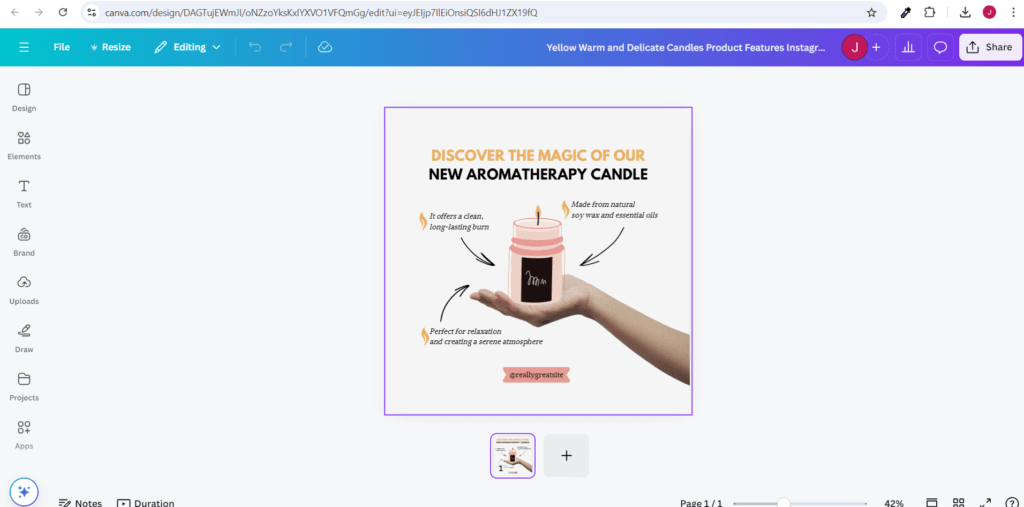
- Elements: These are shapes, icons, or images you can drag and drop onto your design.
- Text: You can add your headline or body text.
- Upload: Here you can upload your own images or videos to use in the design.
These tools are super intuitive—just click and drag what you need!
Tips for Success in Designing Creatives
- Sketch Your Design: Before you jump into Canva, try sketching out your idea on paper. It’ll help you plan better.
- Play with Layouts and Colors: Experiment with different designs and color schemes to see what looks best.
- Practice Makes Perfect: The more you use tools like Canva, the better your designs will become. Keep practicing and don’t be afraid to try new things.
Final Thoughts
By following these steps and practising regularly, you’ll be able to design professional, eye-catching creatives for your Facebook and Instagram ads. Remember, a great creative can make all the difference in whether someone stops scrolling and clicks on your ad!
Awesome !!! 👍👍👍